
Just watched this, a demo of the Pre’s touch-screen UI by their director of user experience, Matias Duarte. (The Pre is a slider smartphone with touch-screen + QWERTY keypad, exclusively from Sprint)
Duarte’s UI demo starts about 1/4 of the way in, after the CEO’s feature summary, it is pretty thorough and long but worth seeing!
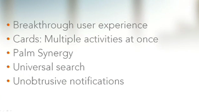
Key takeaways
— Visually (and physically) it’s quite “round”, too round imho! The UI graphics all have a bubbly quality due to heavy rounding which I find cartoony.
(update: I find this smartphone GUI -admittedly Windows Mobile-based- as more attractive visually, and not just b/c my friends at Frog made it ;-)
— Touch sensors in the “dead space” below the screen; I fully expect Apple to follow suit next rev!
— Power via inductive charge tech, using a device called Touchstone; just put the phone on it (stays via magnets) and charges
— Cards (like what iPhone does for multiple Safari windows) is the dominant UI pattern, so you can see multiple apps open at once, zoom in/out, close/arrange the apps around, etc.
— Spotlight-style search and launch just by typing something (kinda like LaunchBar, Quicksilver, etc.)
— Palm Synergy, goes beyond MobileMe, a cloud service that aggregates all your contacts, calendars, IM/SMS from multiple providers (google, yahoo, facebook, etc.)
— Launcher “wave”– a funky app launcher that floats like a wave :-)
— Unobtrusive notifications (phone calls, IMs, mail) — instead of iPhone approach (interruptive, center of screen, modal lock-out until you dismiss), appears at bottom, can be ignored while using another app, becomes iconified like Win system tray
More images from Palm here.
