The rhetorical stance (quote)

Wayne Booth, “The Rhetorical Stance” (1963)

The common ingredient that I find in all of the writing I admire (excluding for now novels, plays, and poems) is something that I shall reluctantly call the rhetorical stance, a stance which depends on discovering and maintaining in any writing situation a proper balance among the three elements that are at work in any communicative effort: the available arguments about the subject itself, the interests and peculiarities of the audience, and the voice, the implied character, of the speaker. I should like to suggest that it is this balance, this rhetorical stance, difficult as it is to describe, that is our main goal as teachers of rhetoric.

The product as argument

Another key tenet of CMU-style of design thought centers around this concept of shaping and delivering arguments, based upon rhetorical motives of effective, persuasive communication. If you treat your product as an argument, it provides a critical lens and systematic framework for deconstructing what you do as a designer. Not merely pushing pixels around or type, image, animations on a blank canvas to make something “cool” and “trendy” but a guided, deliberate, intentional act of communication that directs a person’s behavior and response. It’s not art, but a design act. A rhetorical moment choreographed by the designer’s vision and goals, much like an orator/speaker.

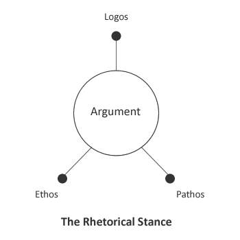
An argument (in the rhetorical sense) has a basic set of three pivotal elements: logical structure (logos), human emotional response (pathos), and the presentational style or voice of delivery (ethos). Held together in balance of emphasis where neither one of these three overpowers the other (known as the rhetorical stance, from Wayne Booth), an effective argument is formed and executed by the speaker.

the rhetorical stance

The relationship to design is apparent, if you consider a product like an iPod or Google’s search page or Dyson’s vaccuum cleaner as an argument. Not a work of art, not cool form, not mass-produced consumerism. As an argument: Its mechanical and operational abilities must function in concert with the emotional response, human affordances, usability/human factors, as well as with its brand, styling, colors, imagery to constitute a well-formed argument that draws the customer in, compelling her to purchase and use the product in her daily lifestyle as appropriate.

In essence, the argument (product) must be deemed useful, usable, and desirable–the invaluable holy trinity of design success! That success is most likely achieved when there is a proper balance of the elements (logos, pathos, ethos) that make up the argument. Engineering, human factors, brand/style must all work in concert effectively without any one overpowering the other. When something is heavy engineering, it’s too “techie” and over complicated for targeted users. When something is driven by usability concerns, it lacks elegance, beauty, aesthetic character which enliven a person’s life. When something is overly stylized and expressive, it becomes frivolous and useless, or even makes a mockery of basic functionality.

Each product is a form of communication that speaks out to potential customers, in subtle and unconscious ways, via the semantics of use, visual signals, formal affordances, and mechanical abilities (ie, features), as well as overal appearance and fit for the user’s situation or context.

Each product is an argument delivering a multi-pronged reason or set of appeals to persuade somebody to use it and enjoy it.

Ultimately, this rhetorical balance (the well-formed argument) is the central task of the designer: to envision and create products appropriate for human situations of use, drawing upon whatever knowledge is needed to get the job done.

There is no perfect design

This pithy phrase may seem like a defeatist, cynical dismissal of product design reality, but it actually refers to the title of a noteworthy book written by Henry Petroski, the brilliant and instructive structural engineer. Everyone should read that book! It is also one of my favorite tenets as a designer, as it speaks to the very nature of designing, particular in complex multi-disciplinary situations.

Design operates amid a complex milieu of opinion, politics, argument, ego, power, control, ego, and of course limits: budgets, resources, timelines. Not to mention competing and often conflicting (or contradictory) priorities held by various departments like QA, Engineering, Customer Service, Documentation, and Human Factors. (the core elements of a product’s lifecycle)

In order for the designer (and rest of the team) to preserve their sanity and achieve shipping goals so as to produce a product that generates meaningful revenue/profit, everyone has to recognize that a design is never 100% perfectly done and is always open to discussion and improvement, due to all the various perspectives and stakeholders. From the smallest tweak to the greatest strategic alignment, improvements are always possible to make it “more perfect”. The challenge is deciding when the design is considered sufficiently ready for sale and use. Product lifecycles cannot continue infinitely iterating…

This relates to something Steve Jobs famously said: “Real artists ship”. It’s not about achieving perfection, whatever that concept means. Who decides what is perfect anyway? Users? The designer? The product manager? The CEO? That’s a whole other discussion about organizational decison-making and political cultures, power structures, etc. Whew…

Back to the topic at hand, in the world of software development, in particuar, there is always a version 2. Tough choices have to be made to ensure a version 1 actually ships. And those ideas that didn’t make the cut the first time around (based upon criteria consensually agreed upon by designer and PM and Dev leads) can still inform the next iteration. This is also related to the issue of dealing with edge cases. There is no perfect design. No design will satisfy 100% of users’ needs. No design will pass all usability tests perfectly. You can’t please everyone all the time.

The sooner the designer and the entire product development team (and their respective allies) accept this truth, the better off everyone will be in making the necessary choices upfront to better secure and sustain productive (and happier) design efforts over the long-run.

Necessary yet sufficient

Following on from “no perfect design”, here’s aother tenet I ascribe to, borrowed from Herb Simon, father of artificial intelligence and Nobel Laureate in economics, as well as former professor at CMU. Simon made a significant contribution to design theory as well, with his profound work, The Sciences of the Artitifical, which emphasizes the centrality of decision-making and cognitive processing of information, as a means of transforming existing situations into preferred situations. (there’s that word, situation, again…more on this later) According to Simon, anyone who takes courses of action aimed at the preferred state, whether a surgeon or an engineer, is in Simon’s perspective a “designer”.

For now, let’s focus on this tenet, which suggests that there is a certain threshold of acceptability of performance and achievement, due to cognitive loads and stresses. (the amount of info for effective/efficient mental processing of data)

One can strive for perfection, or one can do what’s the necessary yet sufficient amount for accomplishing the task/goals. This is what Simon referred to as “satisficing”: satisfy + suffice. As opposed to 100% optimization or perfection of achievement. Being a designer dealing with multiple projects, tight deadlines, tighter resourcing and complex issues from various folks vying for supremacy and credit in the final solution, targeting that which is sufficient is very welcome concept indeed!

Also this concept pertains to domain expertise, deep-diving into competitive analysis, market analysis, and of course understanding the target user population. One could spend inordinate amounts of time luxuriously lapping up all that volumes of data but to what end? Sure you’ve got thousands of sticky notes, 100’s of hours of tape, and 100’s of users as data points to help shape a persona or scenario.

But with the reality of constraints, taking a more practical view of getting what is deemed to be a sufficient yet the necessary baseline level is just as good and effective. At some point you reach that cognitive threshold and all that data just doesn’t matter anymore. You’re hitting a wall cognitively, as the mind becomes saturated and thus a loss of marginal or incremental comprehension ensues. Everyone knows a meeting loses effectiveness after the first hour; same for volumes of data. You’ve reached that threshold of acceptable limits. And then as a designer you have to move on to the next phase as needed…

Do what’s necessary. Do what’s sufficient. Keep progress moving forward!

CMU way of thinking

So what is this “CMU way of thinking” really about? Here is my unabashedly biased perspective on the matter ;-)

CMU, or Carnegie Mellon University in Pittsburgh, is globally recognized as a leader in design education, from establishing the world’s first degree program in industrial design in 1934 to recently expanding their graduate design offerings, and developing joint programs with the schools of business and computer science.

But hold on, what is meant by design at CMU?

There is the semi-autonomous School of Design housed within the College of Fine Arts, but it has its own head, faculty, and curriculum, directed towards various types of design education: communication design, industrial design, interaction design, and new product development (joint program with business and engineering), as well as a pivotal program with the rhetoric department. Students subsequently receive a degree in design. They get hired as designers. Period.

However, what confuses many folks (at least other CMU alumni I meet in the Bay Area) is that there is the HCII (Human-Computer Interaction Institute) within the School of Computer Science, which offers a 1 yr master’s degree in HCI. When I tell folks I studied Interaction Design at CMU, immediately people assume it’s from the HCI program. Not quite!

I know I’ll get in trouble for saying this but I’ll just say it. The HCI degree is NOT a design degree. It’s a hybrid degree blending social science, cognitive psychology, and computer science. The HCI degree is a necessary and valuable education focused on computational perspectives, specific methods of user-centered design (UCD) process, including (but not limited to) usability evaluation and user-oriented problem discovery, with heavy emphasis on cognitive psychology and computer science with statistical and usability techniques, plus capturing data (user feedback) towards making design recommendations. This is all extremely useful complementary information and approaches that support designers. I’m all for it! Graduates often go on to become user researchers, usability engineers, and yes even designers too :-)

SO what then is the difference? It’s a bit subtle and loaded with some intellectual speak, but essentially the CMU School of Design mode of thought and practice is centered on design as a “humanistic, liberal art of technological culture” focused on the “conception, planning, and shaping of the artificial” directed towards “individual and collective purposes”. Whoa! Let’s unpack all that…

  1. Humanistic: It may seem like splitting hairs to some folks but this term considers the totality of being human, not just objectified “users” to be statistically analyzed to the nth degree. This includes the emotional, aesthetic, and expressive qualities of people and humanizing technology to support that full range of dimensionality. Beauty, trust, freedom, emotion, and control are all human values that take center stage when designing new products and services.
  2. Liberal Art: Just like in a typical college education, referring to a liberal arts degree that is well-rounded, thus provides a total perspective on human issues and problem-solving. It is expansive, exploring new territories of thought and meaning, and inventive possibilities drawing from various disciplines. Plus it is an “art” (as opposed to method-driven); per Dick Buchanan, an art is a long-term, strategically oriented set of concepts, connected in some systematic, disciplined manner with a holistic, total view in mind of a situation or problem. A method is tactical and diverse in nature (there are hundreds of methods to choose from, but only a select few arts that guide one’s thinking) targeting immediate issues in a tightly constrained manner. I agree it’s a subtle distinction, but worth pondering the slight but powerful differences…
  3. Conception, planning, and creation: Sounds like core phases of the design process! This refers to the human-driven ability to conceive, plan, and create something that solves human problems and improves conditions.
  4. Individual and collective purposes: Refers to creating solutions that solve problems for single person’s goals OR for groups, teams, organizations, even entire societies, to help them achieve their cumulative goals and fulfill their purposes (think of goal-directed design).

And technological culture…This refers to the modern day of course, but this label can be applied to any time period or culture/society/community where technologies (whether mechanical or digital or beyond) influence and shape people’s behaviors and attitudes about living, working, playing, etc. Designers equipped with this humanistic perspective can help invent valuable solutions where the technologies better fit human needs and concerns.

So there you have it, a quick sketch of the main ideas that define the distinctly CMU approach to design. Much of this comes from Buchanan’s work on the “rhetorical dimensions of design”, which I will evolve further in later postings.

For now, these posts should help shape a better understanding of what all that entails:

Core ideas of design

Core design abilities

Purposes of design