Design for “expected convenience”

Had a great brainstorming breakfast session with a couple friends starting up a new digital product. During the convo, the profound yet alarmingly obvious concept of designing for “expected convenience” emerged (okay, I think I coined it. Hey if Dan Saffer can invent “topless meetings”, I’m gonna claim this one! :-)

The idea is quite basic: instead of killing yourself desperately clawing your way to get the “next iPod”– a massive gamechanger and cultural and economic powerhouse–focus on modest, simple targeted improvements to your product, and thus the overall user experience, leading to delight and satisfaction. Many of these things are those Aha! moments of user’s gratitude–where the user says “thank you”, literally! Why? because someone thought about the small things–

  • The iPhone has the ring silencer on the outside as a physical switch, not a digital control lost in the menus.
  • Firefox download window has an icon to view the file in the Finder
  • Photoshop palettes snap and can be re-combined in infinite ways
  • Google Mail shows a link to view your just sent message immediately after sending it to calm those freakouts of a bad email
  • Mac OS prompts you if your files are too large to transfer to a drive, before copying begins

The funny thing is the concept arose from talking about a totally non-digital item: wheels on luggage. It’s simply expected fact that most pieces of luggage have wheels on them but it’s a relatively recent invention that has become simply expected convenience. Small shift in insight and change that yields great ease/satisfaction for the user. And of course your user base will love you for it, because they’re clever, smart, well-thought out, and… well, convenient. This gets your user to think “how did I live without this” yet it’s so effortless, transparent, intuitive, and just blends into their tasks/activities flow.

When a CEO gets it

Ok, enough of Steve Jobs. So how about A.G. Lafley, from Procter and Gamble? From Business Week Online:

In his new book, The Game-Changer: How You Can Drive Revenue and Profit Growth with Innovation, P&G CEO A.G. Lafley explains the difference between the two methods: “Business schools tend to focus on inductive thinking (based on directly observable facts) and deductive thinking (logic and analysis, typically based on past evidence),” he writes. “Design schools emphasize abductive thinking—imagining what could be possible. This new thinking approach helps us challenge assumed constraints and add to ideas, versus discouraging them.”

Again, this is from the C E fracking O, which makes a world of a difference in my view, as it symbolizes and expresses a profound understanding of design’s differentiating value, not limited to vapid “look we got user experience with our lickable buttons, rah rah” silliness. The fact that this guy groks the different flavors of creative thinking and has supported company-wide design workshops for various departments, this speaks well of Lafley’s commitment to cultivating a good design practice and culture in what presumably is a design-deficient yet bureaucratically process-laden company.

(dark) Gray’s anatomy

The cool trend in visual design lately for web-based and desktop UI has been applying “dark gray” (or charcoal gray or slate gray) for various sections of an application’s interface. iPhoto (and the various apps in the iLife suite) seem to be the first to start this trend, with having palettes for adjustments and so forth rendered in a semitransparent ~ 75% #333 look, as an attractive complement to the main application UI. Apple, being the fashionista leaders of digital visual styles, made it hip and cool…and so “dark gray” has been The New Black for some time now. (along with orange, green, blue, etc. you get the picture ;-) And it’s great as an accent color or punch color.

However, I’ve noticed lately that Adobe’s new web-based offerings, arising from the macromedia acquisition, go for the dark gray look with overwhelming aggressive force, perhaps to the detriment of the product’s aesthetic quality and usability. Hey, I love the dark look, don’t get me wrong. I love that sexy glossy piano-black finish, like high-end gadgetry, or the Lamborghini Superleggera (a “wondrous riot of carbon fibre” as one car ‘zine enthusiastically declares). And I know pro video and photo and 3D modeling apps have had a “dark UI” for many years before it became hip, primarily b/c their users use them in some darkened room! (Modo in particular has a very nice visual style overall)

But when it’s a single dominant shade for the entire freaking UI of mainstream (“everyman”) app, per some trendy Web 2.0 RIA ethos, as done for Adobe’s Media Player, Photoshop Express, Digital Editions, and whatever else coming down from the Adobe Labs (including the AIR installer dialogs), I just find it all a bit…problematic. (also guilty, is MS’s Expressions Blend)

  • In terms of mood, it feels quite heavy and grim, almost depressing if not stale
  • Practically speaking, the look can obscure user’s tools and commands and menus, making them hard to find in order to accomplish a task
  • Text becomes lost or indecipherable; or you have the “sparkle” effect of light text against dark backgrounds
  • The focus of interaction can become lost, particularly if both the primary focus window and the background application are rendered in the same gray shades with little contrast
  • If everything is gray, then how does one distinguish easily disabled controls? The hierarchy of UI planes or windows can be lost
  • Overall the UI loses the rhythm and texture of contrasts, as the eye gets lost in a sea of flat sameness, overdone for the sake of “coolness”, which unfortunately devolves into “lameness”, thus backfiring upon the entire user experience

I understand the original Adobe motivations behind the “dark gray” look: for a sense of fresh hipness as fashionable street cred (as XD head Michael Gough once told us at Adobe, “we’re all fashion designers now”–and certainly style does matter as I’ve said many times as well), for ostensibly minimizing the interface chrome (as “no-chrome”), and of course for videos and photos to visually “pop” nicely.

I just think it’s a little overdone when it comes to the newest creations from Adobe Labs. Other better examples include:

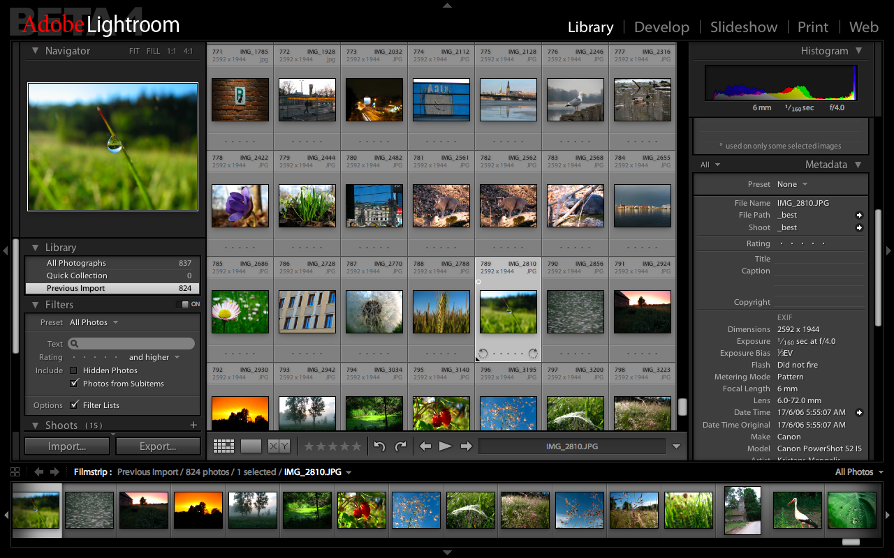
Adobe’s Lightroom does a fabulous job of applying a darkness but balanced with lighter gray shades, and it all feels somehow appropriate, a sense of “fit”, for the product’s purpose and value to the critical pro photographer carefully (and rapidly) sorting and adjusting hi-res images for a client. It truly is a digital darkroom experience made real in the interface.

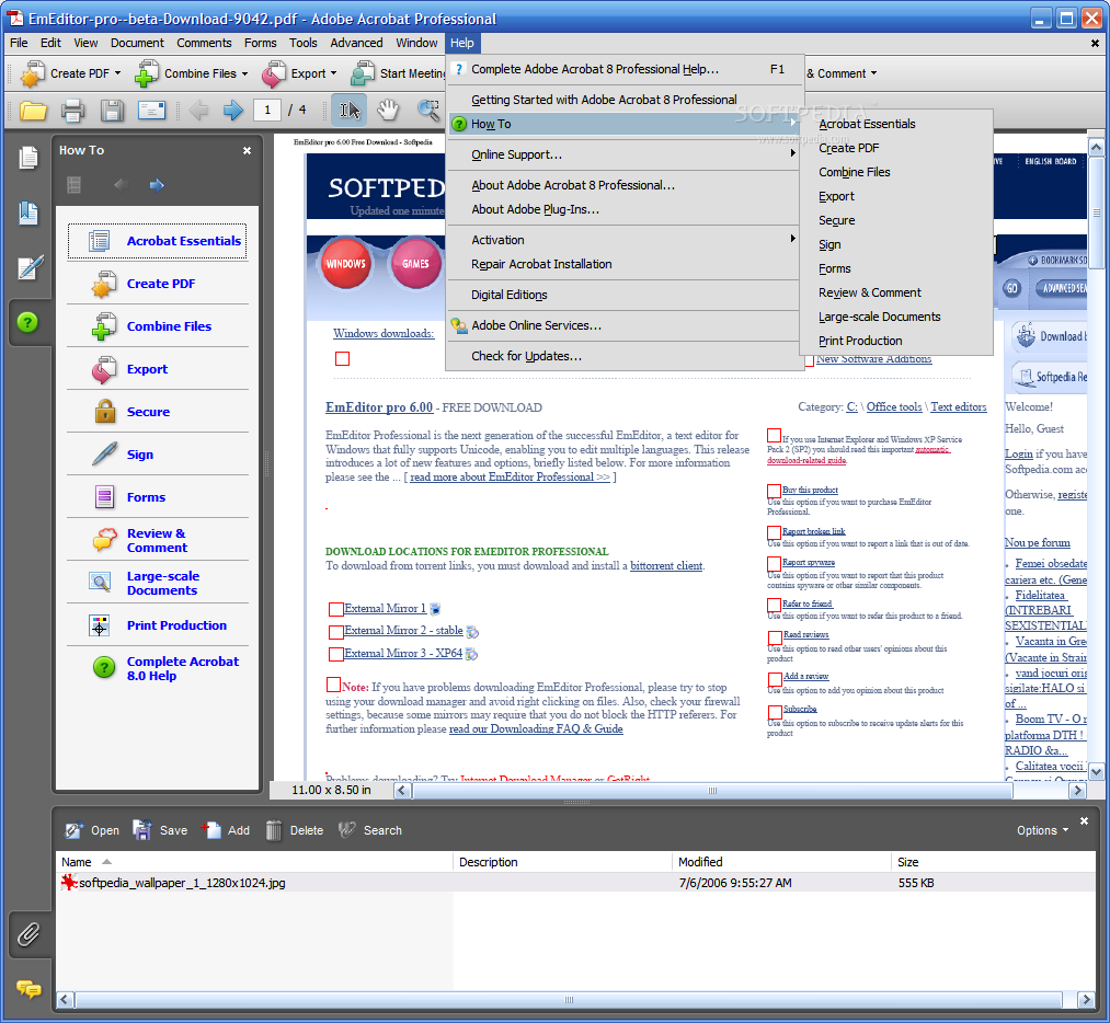
Adobe’s Acrobat has a nice use of the “dark gray” for the side well, nicely contrasting the overall lighter look, as an accent/punch color. It also defines clearly a functional zone or area that the eye can quickly gravitate towards and develop an easily remembered/recall-able mental model for the next use. Again, balancing against the dominant lighter UI for reading documents in enterprise environments, etc.

And coming back to Apple’s iPhoto and Aperture and iLife products, using the “dark gray” for transient palettes, rather than the central task area. It works nicely (although personally, the palettes are just a bit too transparent for me, making some palette labels and controls harder to read/use)… Dark gray works also for other peripheral or transient UI’s: I have Adium set in the dark gray (and minimal) style, I love Growl’s nifty status messages, Apple’s HUDs and tooltips offering key commands, so forth.

I just think for their interface style, Adobe Labs and XD team might consider some elegant contrast, towards improving product usability and add some rhythm and texture to the interface. Or even try multiple shades of gray, some lighter and darker, with touches of other colors as highlights. Contrast, balance, all the stuff Mullet/Sano describe in their classic textbook of visual UI design. Else, going all the way with just one dominant pervasive tone of “dark gray” can undermine or obscure the niftiness and the coolness of the novel products & features.

Cordell on cultural change

(Don’t you just love alliterative titles?) I noticed this interview by Adaptive Path of our User Experience boss at Cisco, Cordell Ratzlaff:
http://www.adaptivepath.com/ideas/essays/archives/000926.php

UPDATE: Here’s the video clip of the talk he gave at the MX Conference recently.

Found this part particularly valuable, about the challenges of inciting and sustaining cultural change around user experience/design:

CR: Ninety percent of the effort is about affecting culture change. The design work is actually the easy part. Transformation tactics that have worked well include:

• Inspiring people with a clear vision. A shared vision that people are excited about will take on its own momentum

• Setting high standards and sticking to them. We’ve sought out opportunities to point out that the old way of doing things is not acceptable

• Persistence. Change is hard and corporate inertia can be difficult to overcome. It’s much easier to manage the status quo than to enforce change. Senior leadership communicates and reinforces the benefits of making this transformation every chance we getDelivering and celebrating successes along the way has helped everyone see that all the hard work associated with the change is worth it.

That’s at the high level, which I totally agree with. Being one of the soldiers in the trenches, I’ve been doing the following to enable what Cordell describes:

• Create high quality deliverables: make those wireframes, mockups, flow diagrams look extra sharp and communicative! show that you design your own deliverables too and not something just spit out at the end…people notice that.

• Provide clear, efficient readable specs and supplemental materials: demonstrate that design functions at the mundane level as well as the “cool features”

• Take a stand on feature-creep and forcing questions at reviews: purpose, value, motivations…forces everyone to realize that UX is valuable and plays at every level of the “product development” game, not just personas at the beginning, and specs at the end, but a fully involved player

These aren’t big things like training sessions and giant posters (which we hope to get to do someday), but I think if you want to spread awareness, understanding, and appreciation, you gotta start with being the model yourself and then hopefully people will see it and respect you for it, and just maybe join in the fun. These are some simple, small actions that cumulatively can help spread design goodness!

Spectrum of Prototyping

I recently created this short poster as a personal means of illustrating in a compelling manner the core phases and tools and types for prototyping a UI design (focused exclusively, from the broader user-centered design process).

Spectrum of Prototyping

Basically I suggest that prototyping is an activity that enables the designer’s journey from abstraction (a novel but fuzzy idea) towards reality (the engineered product), in concert with a multi-disciplinary team.

That journey involves, as I see it, three major phases:

1. Exploratory PLAY: prelim exploration and play, trying out options, feeling out boundaries and limits, gathering early user inputs, making sense of toolkits, etc. This takes the form of whiteboard sketches, paper prototypes, sandboxed code tests, throwaway exercises, etc.

2. Communicative PROPOSAL: well-formed proposal for discussion, iteration, and formal usability evaluation. This takes the form of a concept car, sales demo, vision video, proof of concept, etc.

3. Declarative SPECIFICATION: specified solution with granular decisions for the content, behavior, and visuals, whereby the prototype is a functional demonstration of the real product’s features/styles. The prototype is robust enough to serve as the design spec itself (with minimal supporting documentation).

The end goal is achieving a prototype that effectively serves as the spec, or “prototype-as-spec” (proto-spec, as some have called it). It is a behavioral representation of the real product, at a highly resolved degree of fidelity for effective communication of the intended vision to the programmers, and QA testers. This would help get designers out of the documentation maintenance quagmire, and foster stronger ties between design and engineering, also provide efficient, clearer communication of what the design should do! 200 page Word documents with endless tables and labeled figures can only do so much…and can actually be counter-productive! Having a robust behavioral prototype of the real thing is much preferable for designers and programmers alike.